How lackluster character design can lead to a mediocre movie
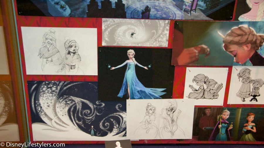
A collage of images from sketches of scenes to stills of final renders shows the work that goes into designing a movie.
June 1, 2021
Visual storytelling is one of the most intricate forms of storytelling, yet with so many little details to focus on, some things can get lost in translation.
One of the most effective ways to get a story across without saying a word is through character design. From conception to the silver screen, characters experience changes before we see them. An animator must ask himself how he can communicate a character’s arc without dialogue, an important step in the process of movie-making.
Recently, feeling that major animated movies have begun to slack in character design, I took a look back at 2019 and found that plenty of animated movies were released, most notably, Disney’s “Frozen 2” and 20th Century Fox’s “Spies in Disguise.”
Now, you may be thinking, “Why mention ‘Spies in Disguise?’” or “How are you going to effectively compare two wildly different movies?” Both valid questions. To answer the first, “Spies in Disguise” is genuinely one of my favorite movies for a multitude of reasons, mostly because of how visually appealing it is. The second question will be answered in due time if you’ll please bear with me.
Obviously, the movies are incredibly different stylistically and story-wise. I think both are great movies, but I have serious problems with “Frozen 2” that I can explain using “Spies in Disguise.”
To start, with Disney’s relatively new 3D animation, characters often lack the interesting shapes and silhouettes that can make them so visually pleasing. One of the first rules of character design is to create a character through shapes that can represent their personality.
For example, in “Spies in Disguise,” both Lance Sterling (the main character and hero) and Killian (the primary antagonist) are clearly made of triangular shapes. Their torsos and their heads are both wide at the top and come down to a point, through their waists and chins, respectively. Though they are in opposition for the entire movie, they have similar silhouettes which demonstrates an unwillingness for compromise between them.
“Frozen 2” lacks this kind of storytelling. The two main characters, Anna and Elsa, have very similar silhouettes, which have the potential to tell an interesting story but do not quite hit the mark. Even though the relationship between the two sisters has healed since the events of “Frozen,” they are still completely different characters and this comes to a head in several dramatic scenes in the movie. Unfortunately, their different personalities are not shown through their designs.
Anna is kind and understanding, but also stubborn and prideful. To me, this reads as a more circular or square character. She should be much shorter than Elsa and should be made of softer lines to demonstrate her kindness.
In the “Frozen” artbook, Elsa’s original character design is villainous since she was initially supposed to be the main antagonist. While that was decided against in the final cut, Elsa should still be made of much sharper lines to show her belief that she is a monster. She should tower over Anna and have high cheekbones. Some of this could even fall into her costume design, perhaps adding icicles on high points such as shoulders. It would also go to continue the representation of the wall that has been between them for most of their entire lives, a physical barrier to represent an emotional barrier.
Something similar to this is shown in Killian’s character design in “Spies in Disguise.” He has a metal arm that is bulkier than his other arm and that has sharp, talon-like fingers. It makes him more intimidating, is a physical reminder of his past with Lance Sterling, and makes for a very impressive villain.
I do have to give Disney some credit for the way Elsa’s narrative is showcased through her hair and costume. Her hair begins tightly coiled in the first movie, slowly becoming more unraveled until she completely takes her hair down at the end of the sequel, showing that she truly is free and one with her power. Her arc is a beautiful story about accepting yourself that was so close to being perfect.
The divide between Anna and Elsa is simply not shown through their character designs, perhaps in an attempt to make them look like sisters. This also poses an interesting idea – if Elsa is made of sharp edges, then wouldn’t her having her mother’s round eyes add to her arc? If she looked like the villain she sees herself as but still shared her mother’s and sister’s kind eyes, it could’ve added a very interesting element to her visual story and kept the family resemblance.
The main reason we love animated movies so much is the beautiful and captivating visuals. Unfortunately, without the key element of visual storytelling, beauty alone doesn’t hold up.